Street Typography Showcase
Street Typography Showcase
While inspiration for designers abounds on the internet in the form of CSS tips and tricks, color palettes, Photoshop effects and more, an often overlooked aspect of design is the all-important typography that determines how your visitors will consume your content.
If your latest design requires an outside spark, check out these 15 great typography examples in our street typography showcase for your inspiration:
1. Gothic in Mexico

This cool drawing spotted on a Mexico City street corner features an attractive Gothic font with unique lettering on the drawn t-shirt.
2. Hebrew Krang

Unless you can read Hebrew then you’ll be as in the dark as us as to what Krang of Teenage Mutant Ninja Turtles fame represents but the shading and font look great!
3. Photoshop Without Photoshop
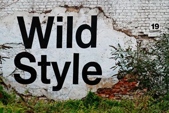
While the font used in the “Wild Style” text may look like it’s been added after the fact, the artist actually took great pains to give that impression with only his paint brush.
4. Rusted 40
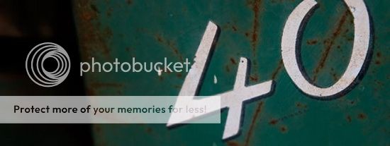
This simple number “40” looks fantastic against its blue, aged and slightly rusty backdrop.
5. Graffiti Cleanup Coolness
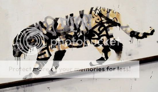
This work of art represents the results of a graffiti cleanup project, proving that there is sometimes a treasure to be found even in the midst of a design mess!
6. Coca-Cola Font
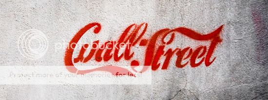
This unique use of the famous and widely recognized font used in Coca-Cola’s logos and other marketing efforts looks fantastic.
7. Only Texture
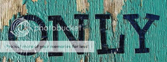
Reminding you that the effect of background textures always adds an attractive, unique look to your design, this photo showcases a single word over a beautifully textured surface.
8. Street Sign on a Wall
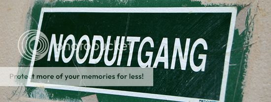
What the featured word means is anyone’s guess but this effort to display a street sign on a concrete wall was done to excellent effect.
9. Big, Bold Graffiti
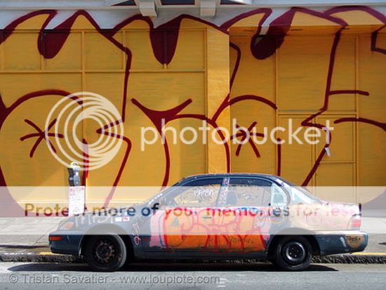
This huge work of graffiti in San Francisco is a great example of a classic urban art font taken to the absolute extreme in terms of size.
10. Typography Showcase
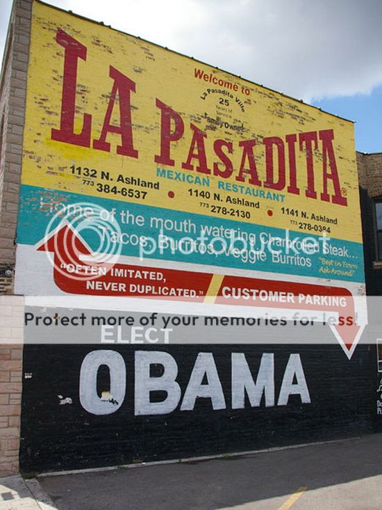
This outside wall in Chicago offers an array of fonts, each offering a different piece of information with topics ranging from the Mexican restaurant inside to the owner’s obvious political leanings.
11. Text on an Angle
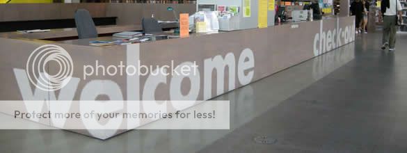
This clever use of typography in a New York office offers clear signage along with an attractive use of textures and angles.
12. School School
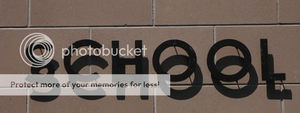
The shadow in this photograph is naturally occurring but it’s nothing that couldn’t be easily replicated for use on digital platforms!
13. NYC Subway
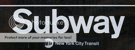
The font used on this sign may be standard and outside of the realm of design excitement but the raindrops covering it give the whole thing a naturally cool appearance.
14. Unintended Typography
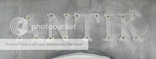
This concrete patch bears the mark of signage past, presenting a new and entirely unintended typography in comparison to the worn area surrounding it.
15. Imagine
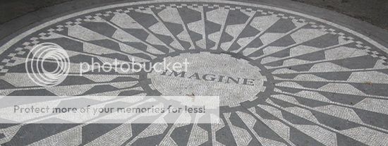
The use of calligraphy-like designs surrounding the word “imagine” draws the eye and offsets the word itself with added visual meaning.
Kate is the creative blogger for VIP Reality blog, the Dallas real estate company.
Image Credits: 1, 2, 3, 4, 5, 6, 7, 8, 9, 10, 11, 12, 13, 14, 15.
Nice combination of typography and street art. I like the first image very much (the bleeding person).